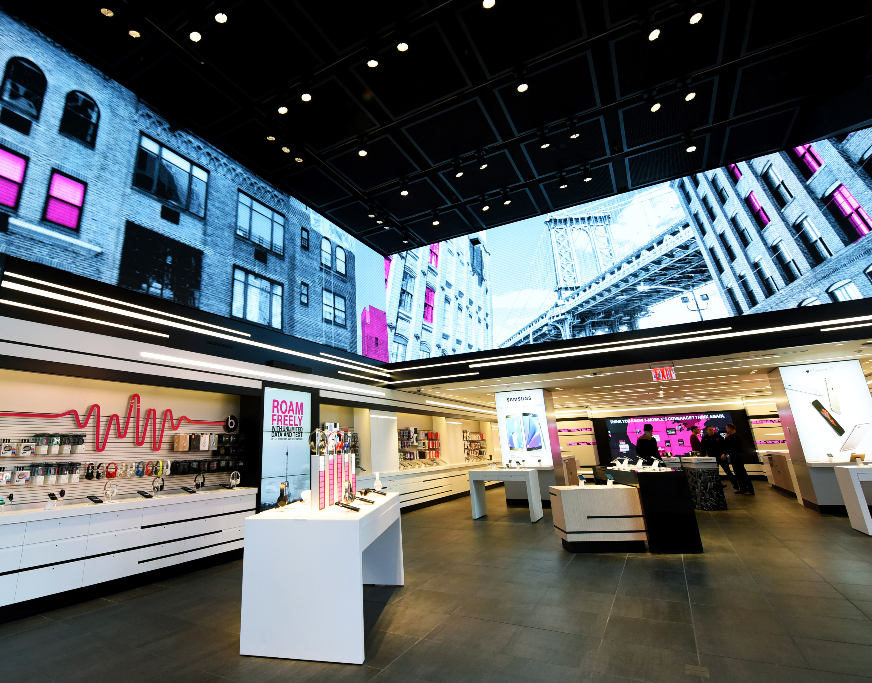
NEW FEATURES AND ALIGNMENT
The first phase of work with T-Mobile’s app was envisioning several new features for the account users and aligning the new designs with a new brand from another project.
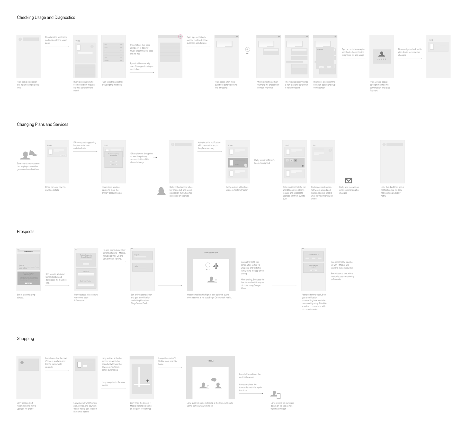
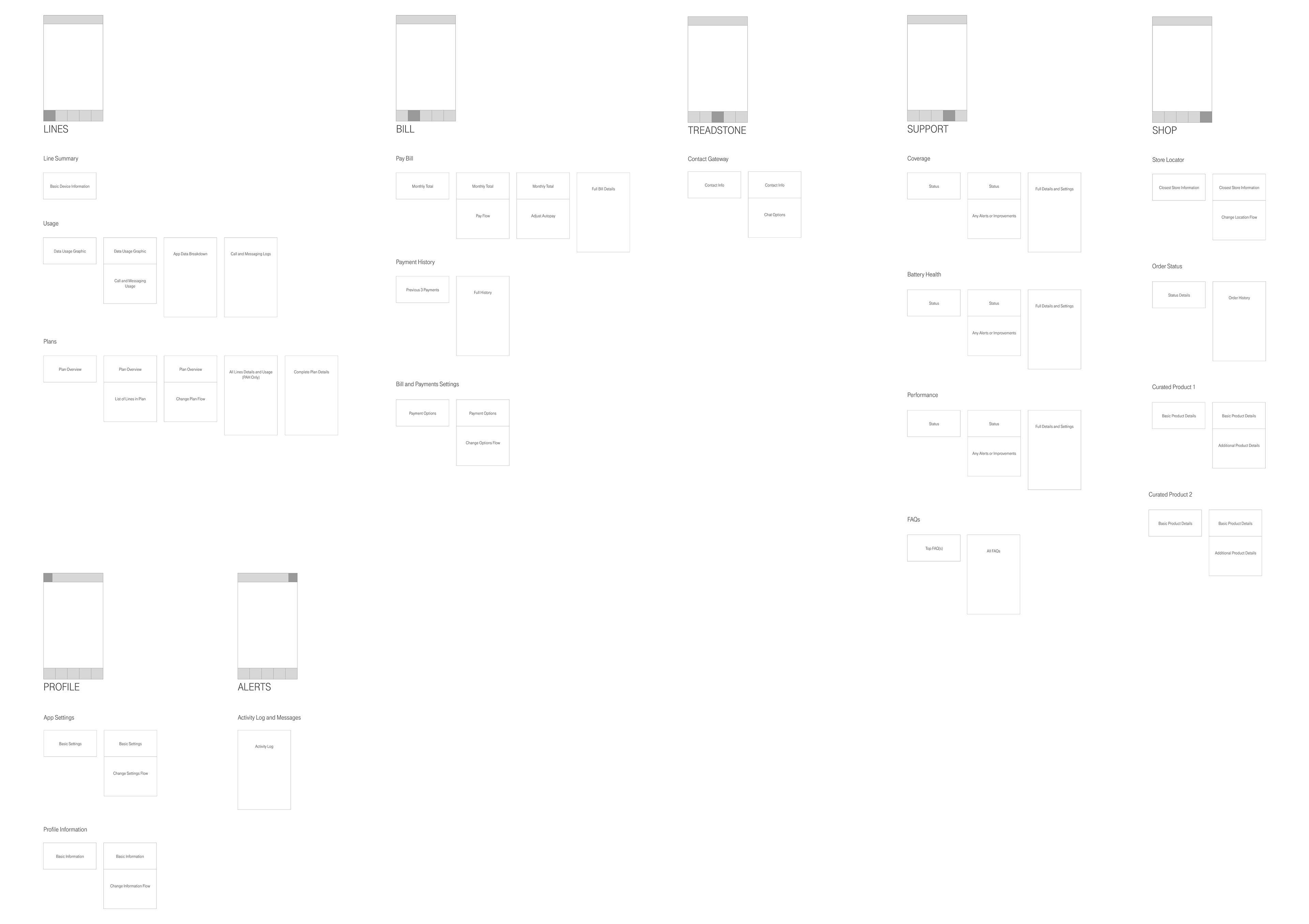
I worked on a small, internal team to draft hero flows and user stories to deliver to T-Mobile’s business team. We focused on several new features including shopping, phone diagnostics, notification, chat support, and new user benefits. We also ideated a new point-based card system for the new designs.

Once the flows and processes were established, I worked on several iterations of wireframes to help bring the stories to life. Through rounds of reviews, I produced wireframes that creative used for visual design and also built several rapid prototypes used in usability testing.
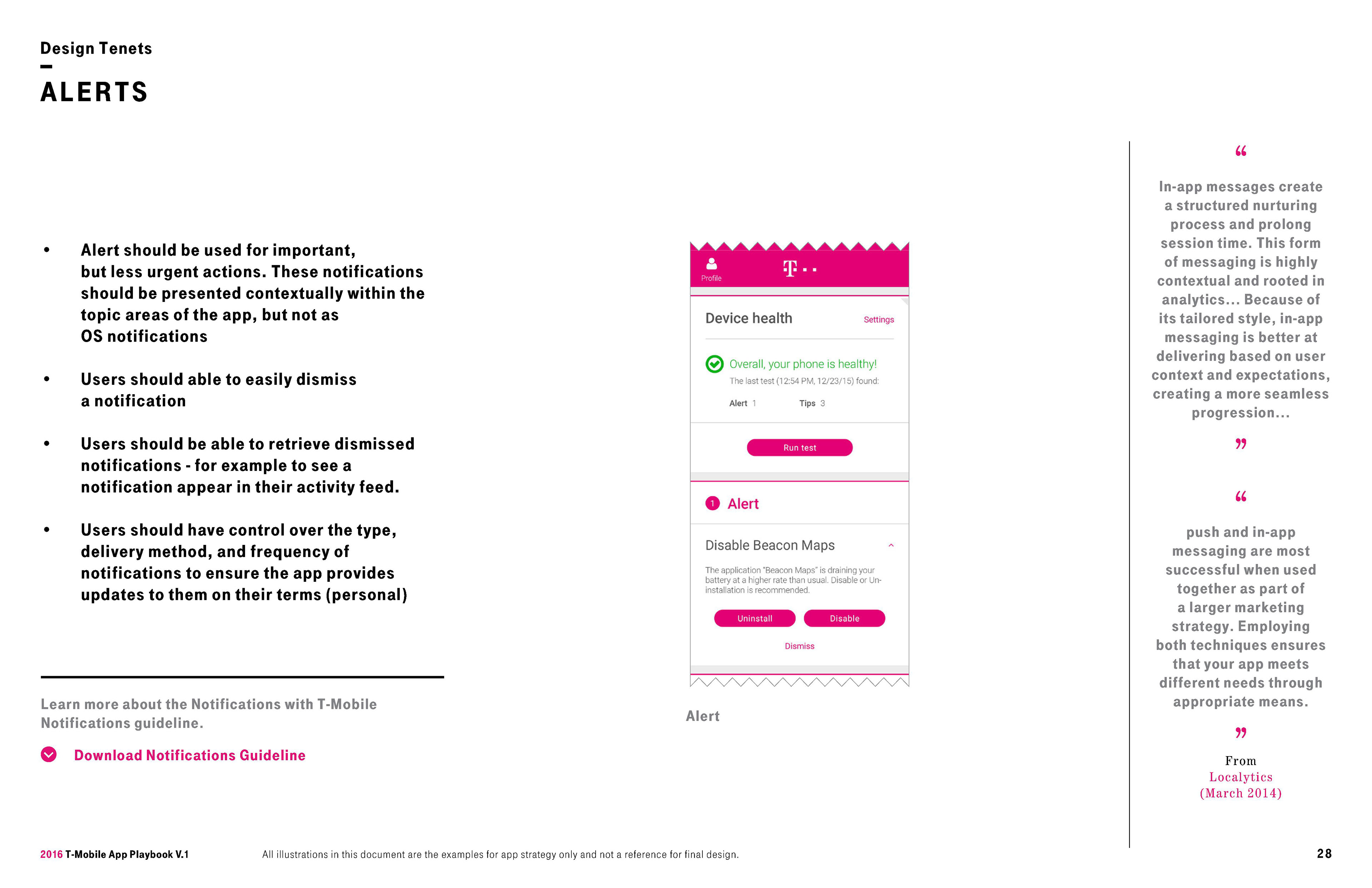

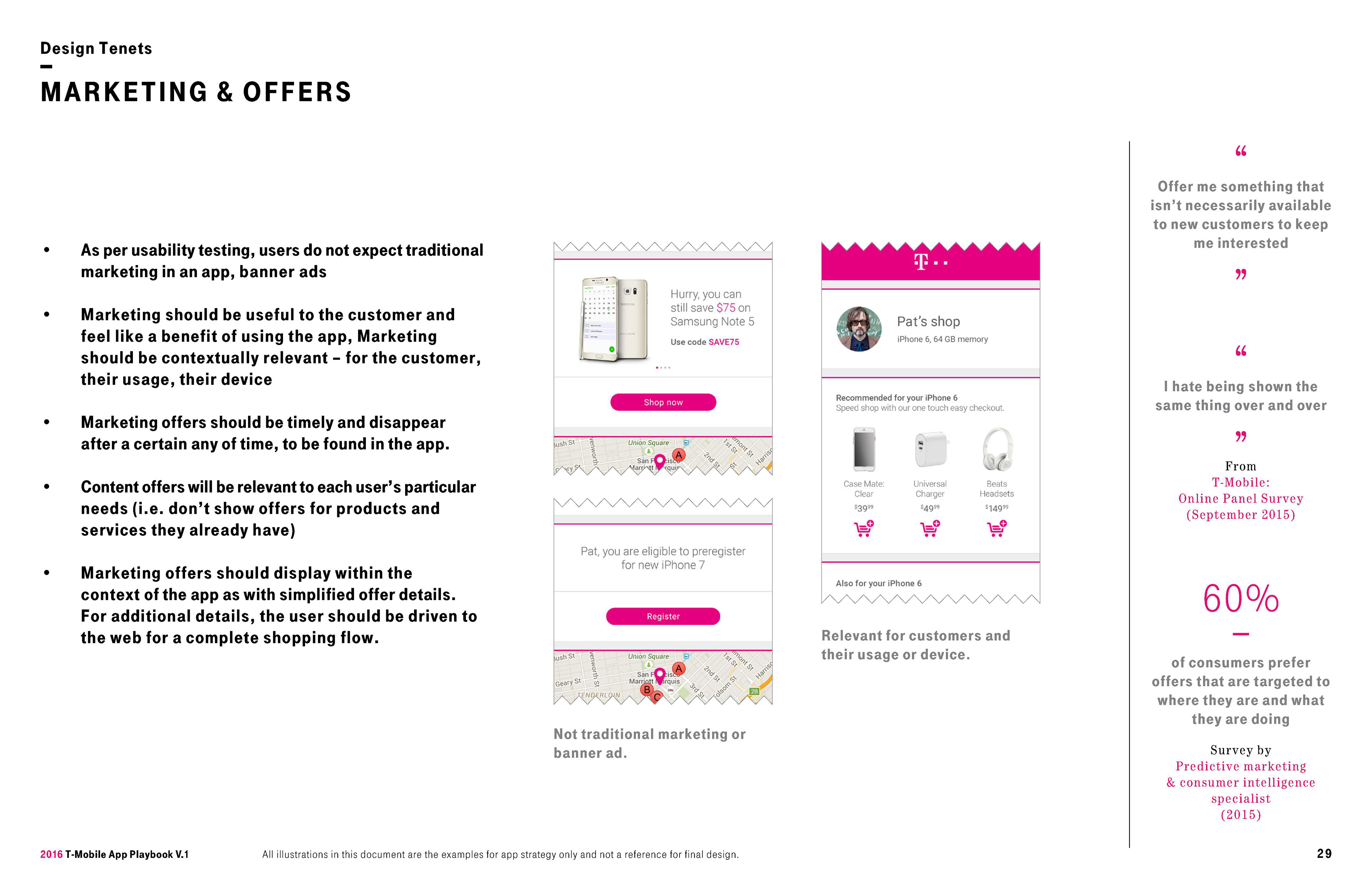
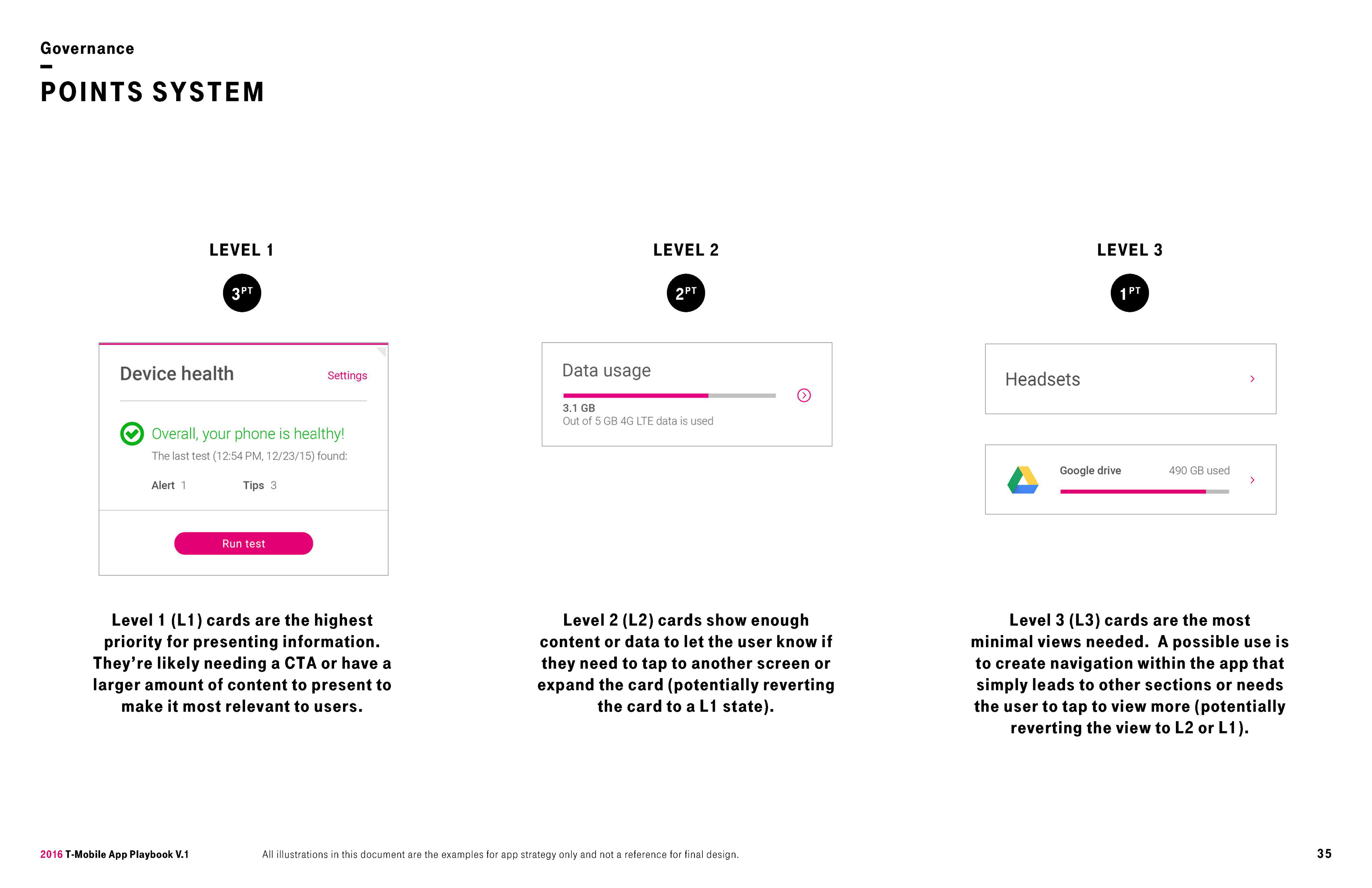
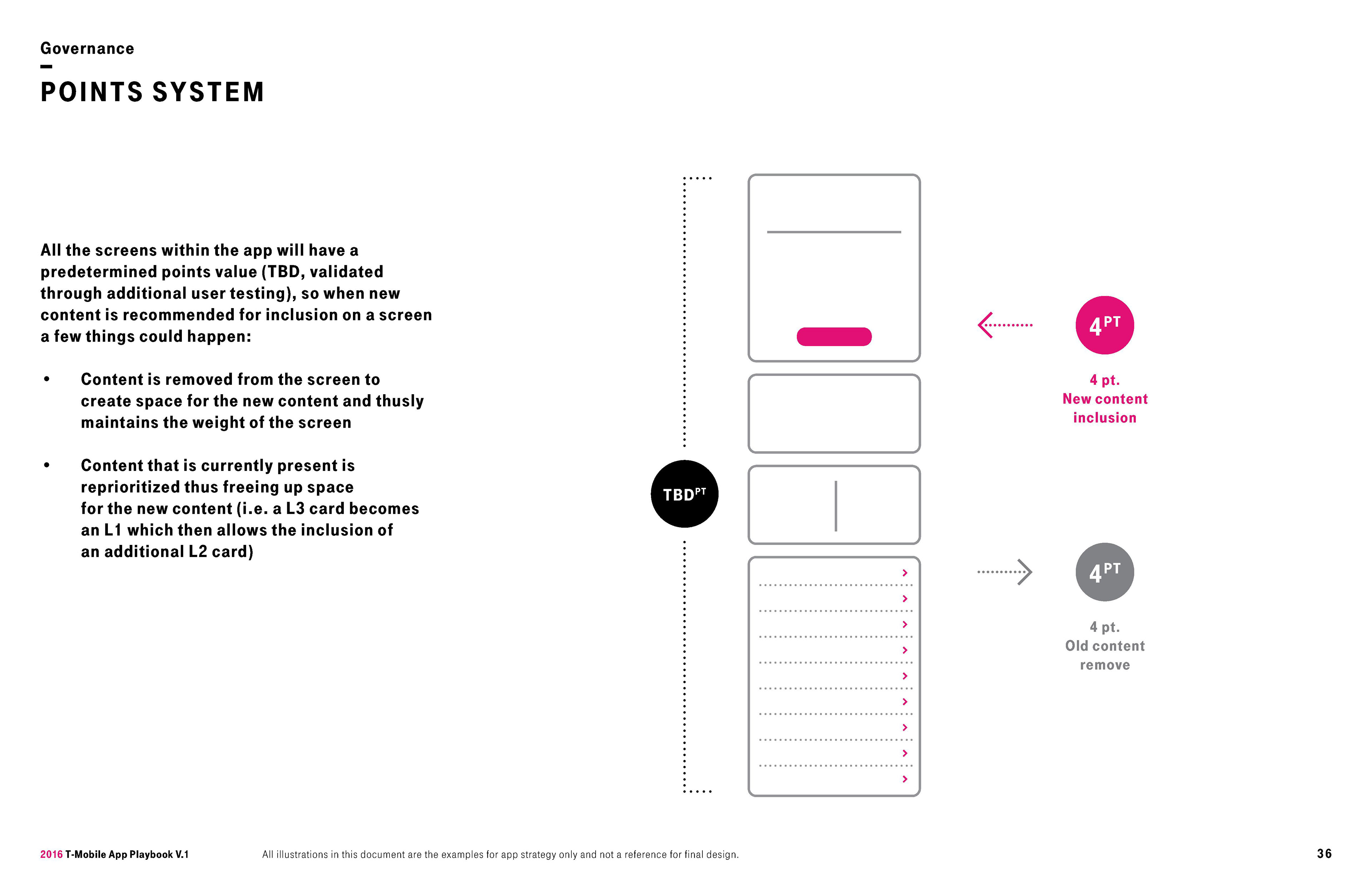
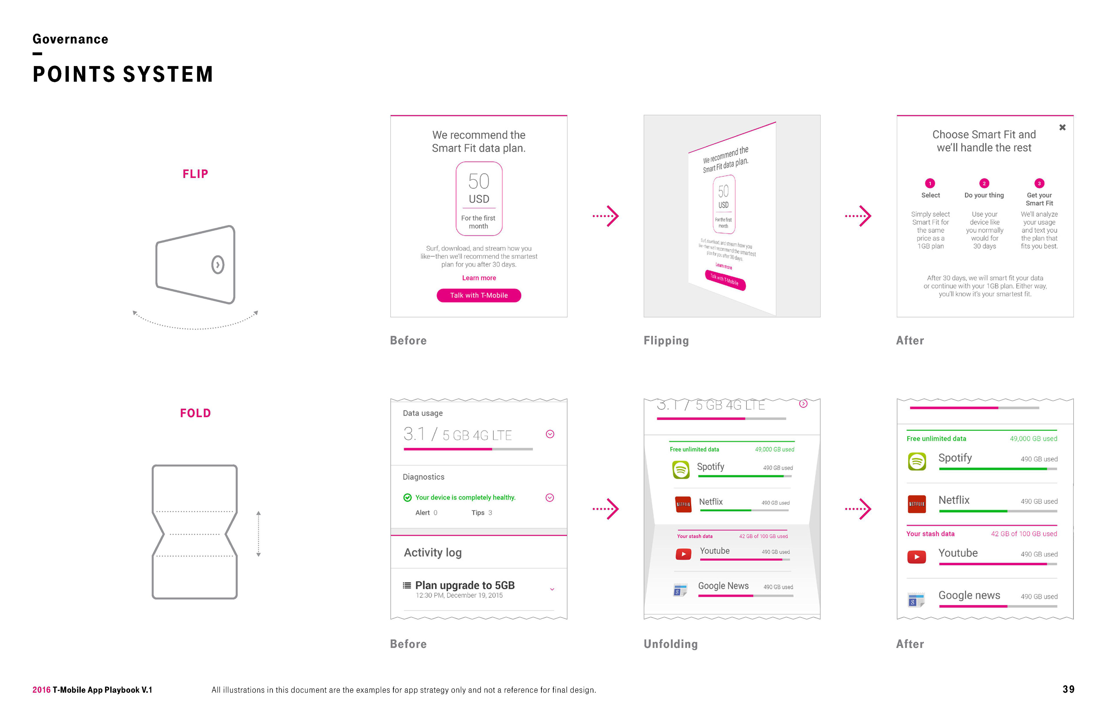
In the end, our UX and creative team delivered a playbook that detailed our new ideas, features, and design system to T-Mobile. We backed our design decisions with research and provided visual designs, prototypes, and usability findings that T-Mobile used for their next steps.
APP CHAT SUPPORT
A separate track of work with T-Mobile’s account app involved the ideation and design of a customer service and support messaging feature.
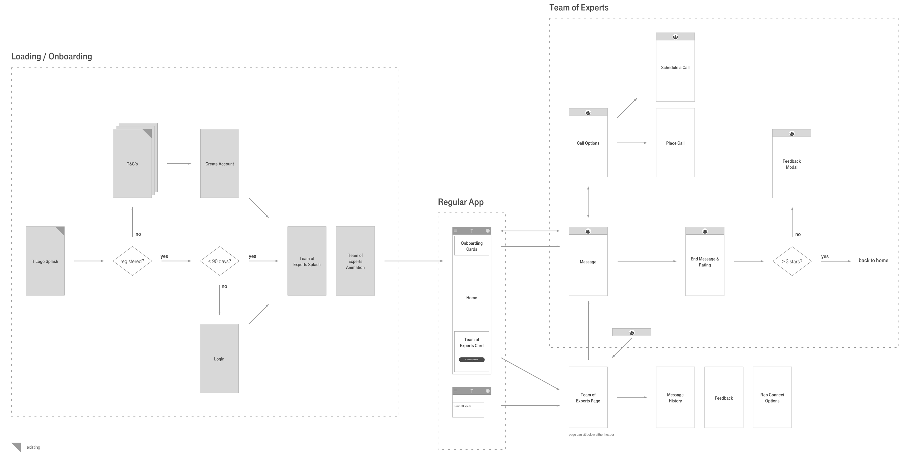
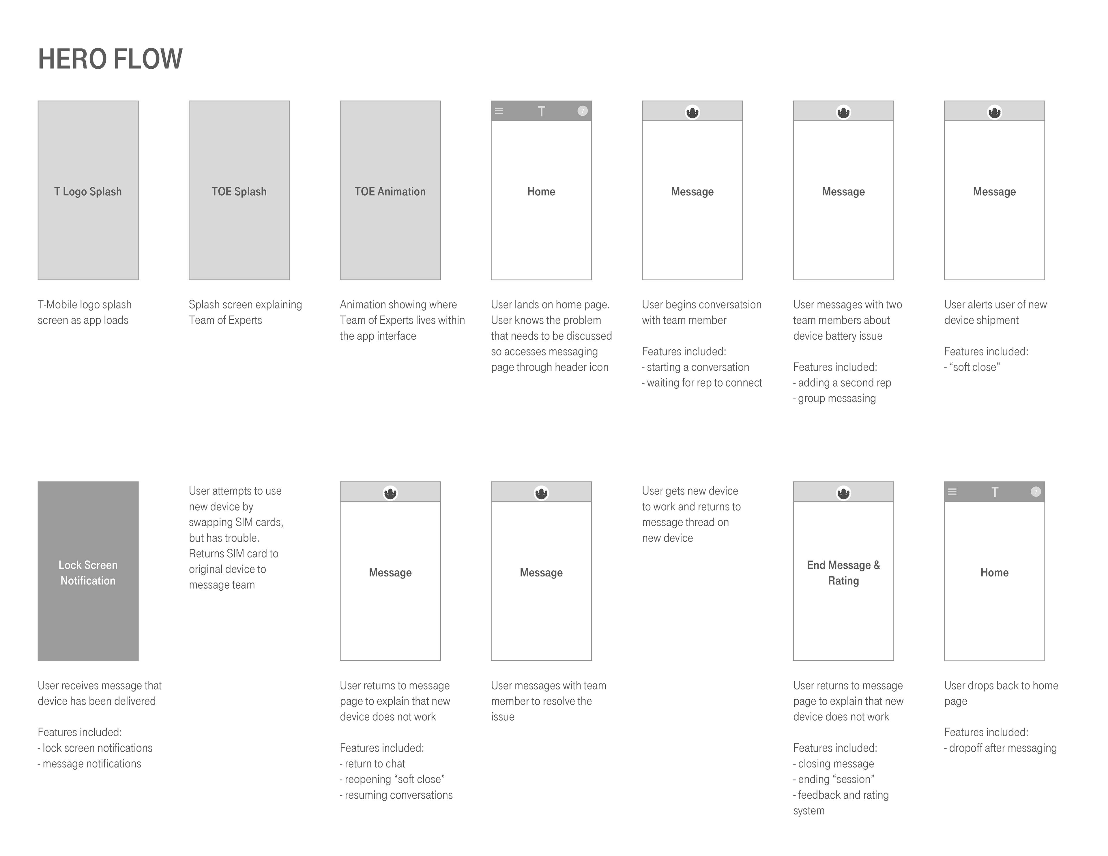
I helped define user stories and hero flows for this new feature and primarily focused on how the user would access and return to the chat screens from the regular account screens.

I also helped design preliminary interfaces through sketching, wireframes, and prototypes to help visualize the new chat feature. Through rounds of reviews with T-Mobile business team, we eventually delivered the necessary screens.
