As part of Razorfish’s pitch work to Taco Bell, I worked with our internal creative and strategy team to think of new features and designs that could stand out in the new app. I helped sketch and formulate ideas that were presented to Taco Bell’s business team that ultimately won us the opportunity to continue work.
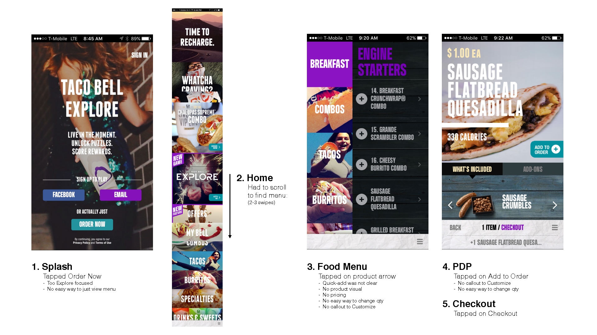
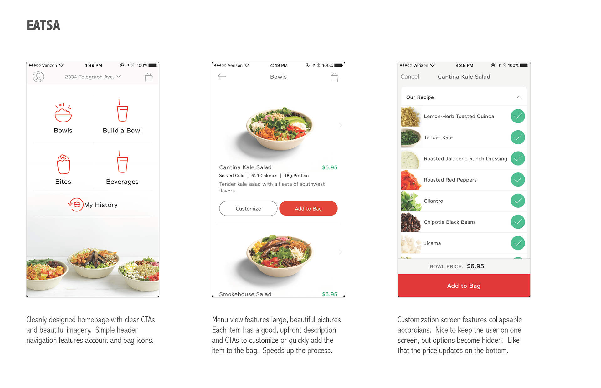
Before the design process, I was tasked with analyzing the current Taco Bell app and similar food ordering apps for features and functions that stood out. I documented what I liked and disliked about apps such as Eatsa, Chik-fil-a, Chipotle, and others to ideate new features that we could include for Taco Bell.
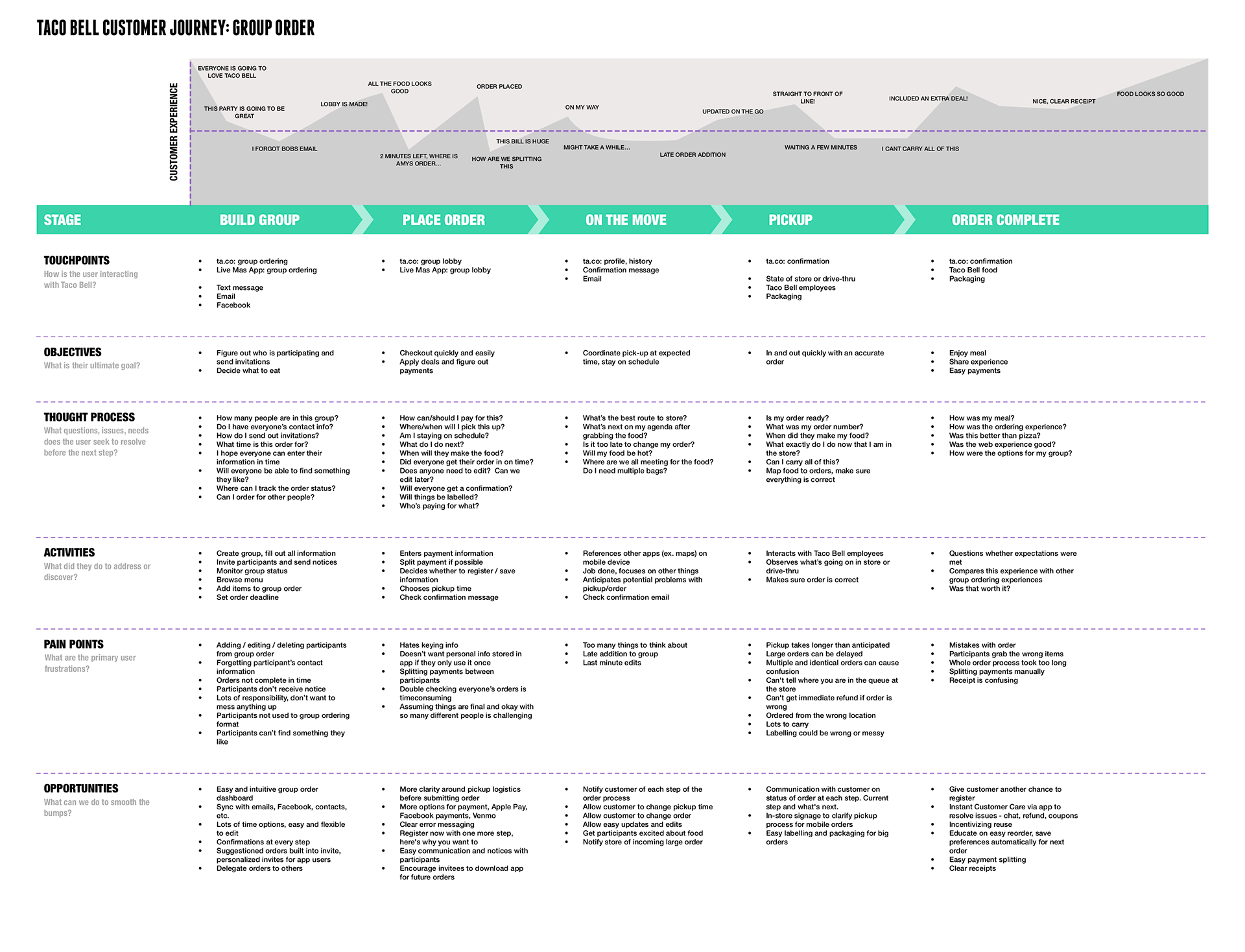
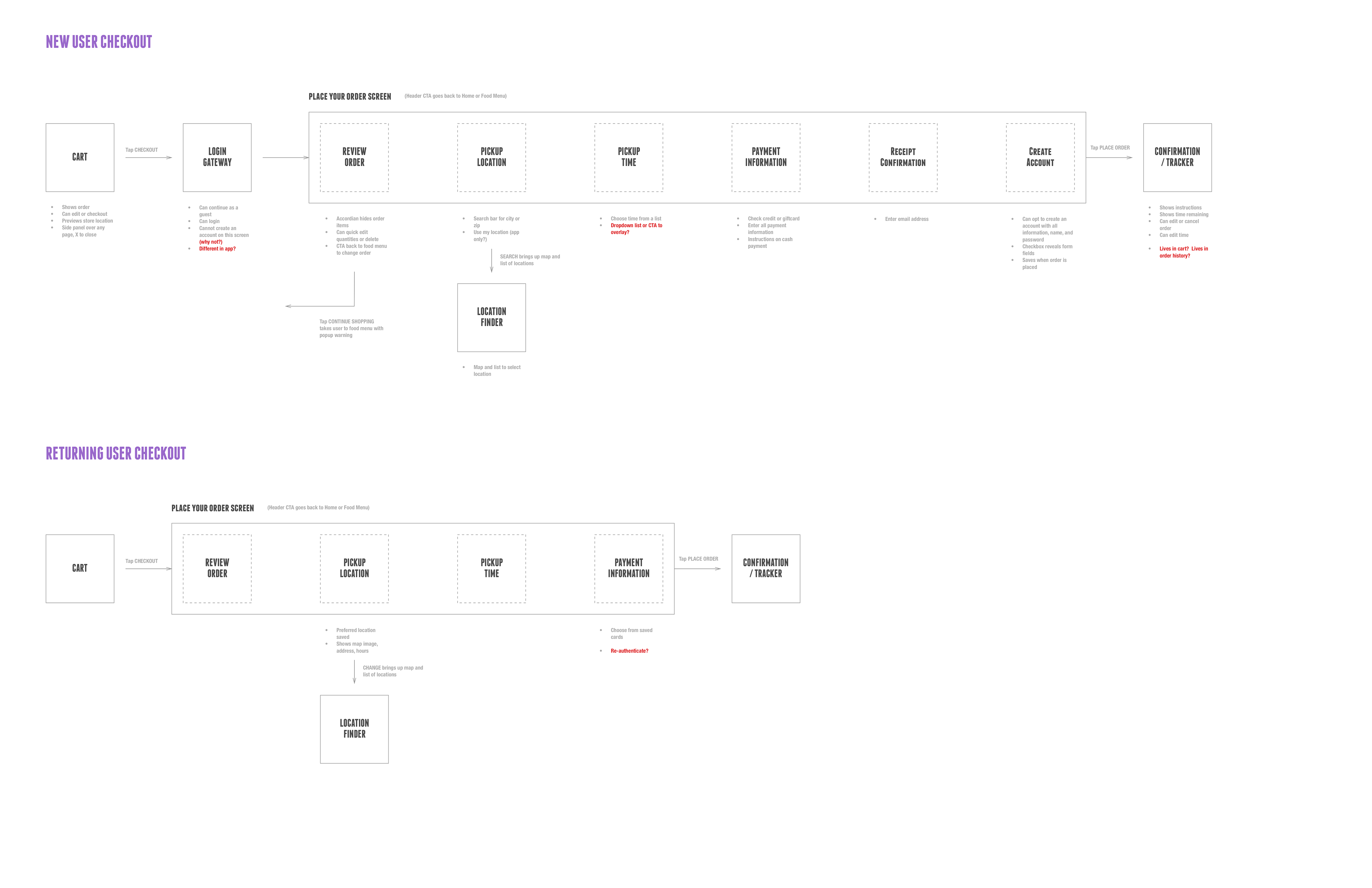
To help understand and formulate our requirements and scope, the UX and strategy team created user journeys and scenarios that we would focus on during design. I helped create documents for specific hero flows such as new user, group ordering, and others.
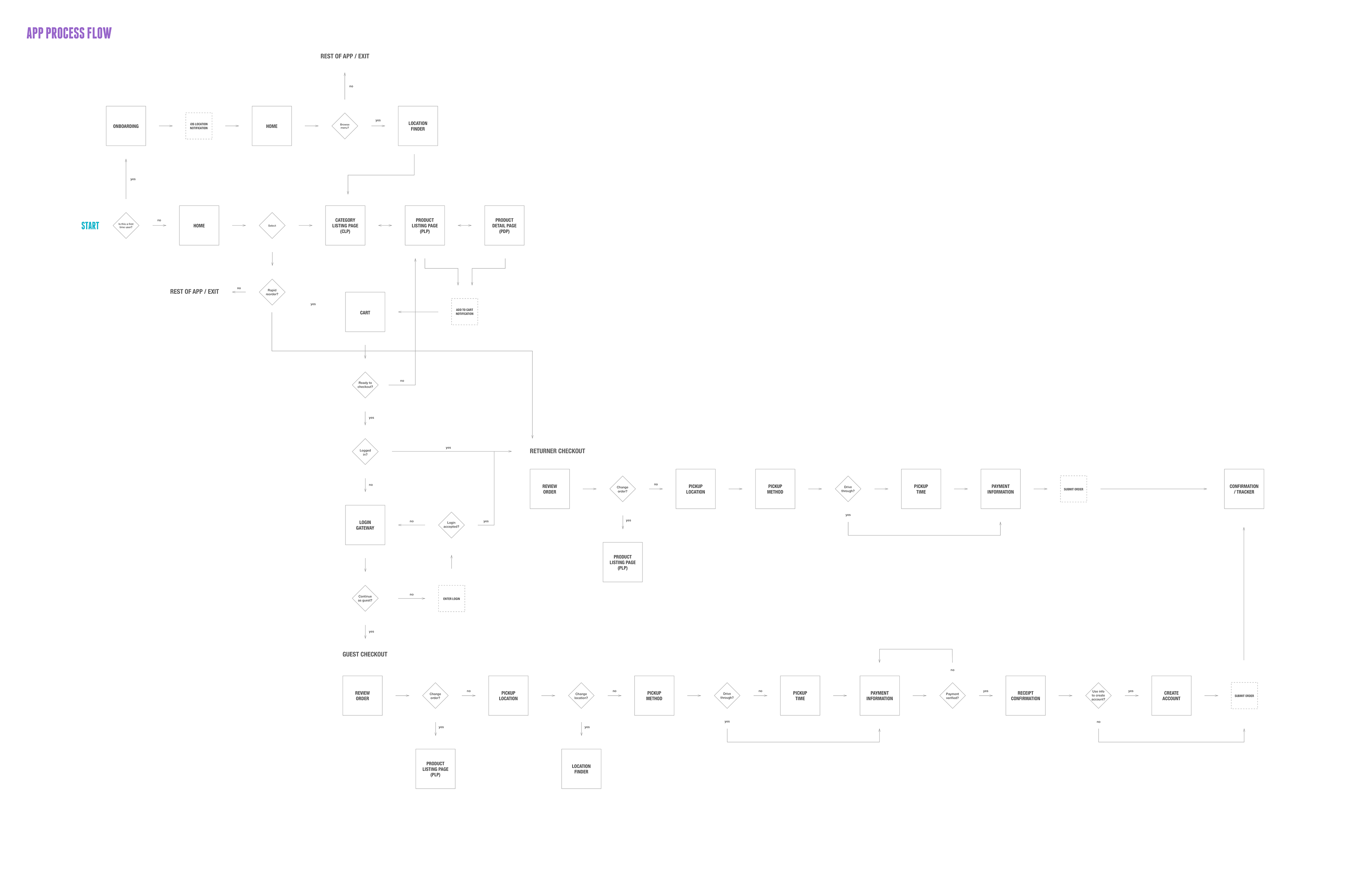
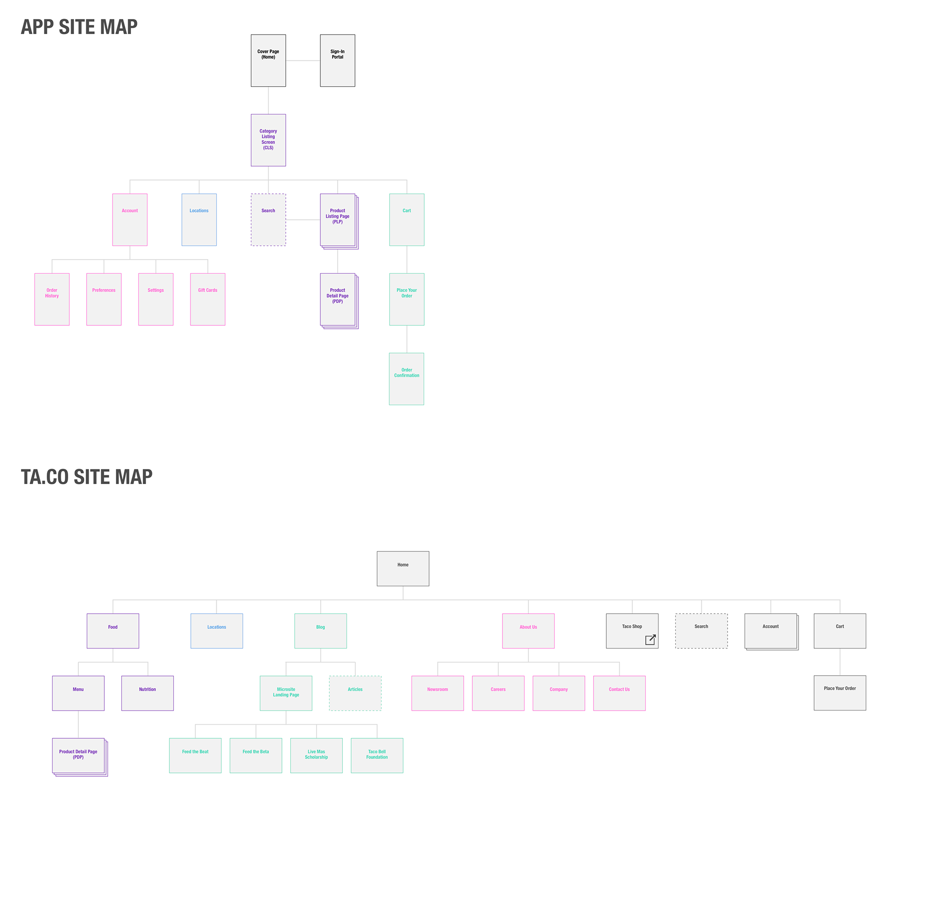
Once we determined the necessary flows and processes we needed to design for I produced an app map that connected all the screens and a sitemap for corresponding ta.co updates. Part of the overall project was not only designing and building the brand new mobile app, but also refreshing Taco Bell's website to keep consistency.
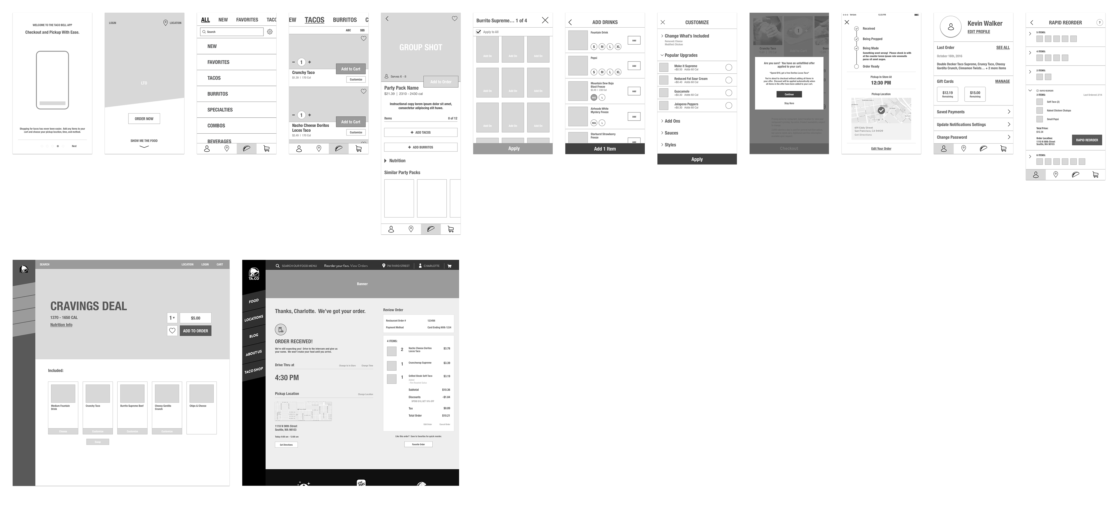
Through rounds and rounds of reviews with Taco Bell’s business team, internal development, and product management, I produced wireframes and low fidelity prototypes for many pages on mobile and web. Specific pages and flows include onboarding, navigation, category listing pages, product detail pages, offers, notifications, order tracker, and profile. I also worked closely with the creative team to turn wireframes to visual designs and iterate on these for delivery to development.

